
It’s amazing how something so simple as painting a room can change the feel of a space completely. It’s easy to see how paint choice can make such an important impact on the place you’re decorating. Unfortunately, we all too often fumble with this important decision. Don’t worry. It happens to everyone- even home improvement-hungry people like us at The Twenties Project. So if you find yourself in the paint aisle going cross-eyed from staring at paint chips for so long, here a couple of rules we follow to try and make the right decision.
First off, the color has to work with the rest of the room. It’s nice to want to pick a color because it’s your favorite or because you grew up with the same color in your living room, but if it doesn’t end up working with your textiles and furniture than it’s better off somewhere else- otherwise you’re going to end up hating it!
Keep in mind though when we’re talking about a paint color “going” with the rest of the room, we don’t mean matching. No. Don’t do it. Here’s the secret to why matching things is frustrating: because colors are not all made the same.
This is your mini science lesson for the day: we all know that the human eye sees color based on a light spectrum. And that light spectrum is created when light bounces off of things. Unfortunately, that means depending on what the light is bouncing off of, the color will appear different to our eyes. Smooth surfaces, textured surfaces, even different types of cloth are very rarely going to appear the exact same color. See what we mean? Paint is never going to match a cushion, or a rug, or a smudge in a painting exactly.
Nor should it! You wouldn’t wear the exact same blue pants and blue shirt because you’d want to avoid obvious comparisons to a blueberry. So making sure that everything in a room was the same color blue would make you feel as if you were living in a blueberry. So unless your name is James and your last residence was a giant peach, stay away from matching everything.
So how do you incorporate color into a room that’s already filled with colorful stuff? Do what the designers do and “pull” a color. It may be the background color of a pillow, or a tiny polka dot on the pattern of your rug. Try and choose a paint chip that most closely resembles that color. You may even want to pick out a few just in case.
When in doubt, go for a neutral color. It’s hard to go wrong and it’s the safest bet for pulling everything in the room together, especially if you’re still recovering from blueberry syndrome.
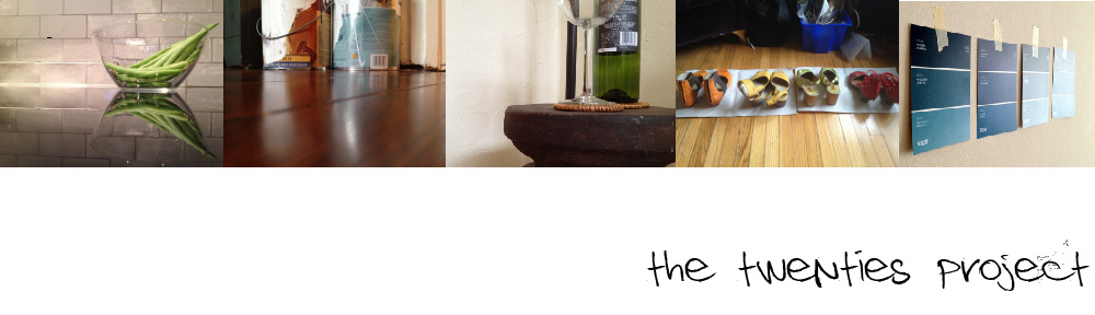
Throw those paint chips up on the wall of the room you wish to paint and leave them. Study them. Live with them a little bit. Look at the tones that are slightly above and slightly below the color you’re thinking about as well.
Move the paint chips around the room occasionally and see how the light bounces off of them. How do they look in the morning compared to the evening? In the night? With the lights on and off? With just one lamp on?
Last but not least, if wavering between two shades of paint is making you go cross-eyed, go for the lighter one. Paint usually dries slightly on the darker side, and once a paint color is up in a room you might find the impact of the darker shade harder to absorb at first.
For example, when I was a teenager and my sister and I shared a room, the only color we could agree on to paint it was yellow. We both decided on what we thought was a really inoffensive, pale yellow color. Once we threw it up on the walls we realized- wow. That’s pretty yellow.
The good news about choosing a paint color is that it doesn’t have to be that stressful. If you really can’t stand the shade of green you picked, or fell out of love with the warm brown you picked out years ago, paint it again! It’s an effective and cheap way to makeover a room to suit whatever it is your style and needs dictate.

