A Bold New World

Some of you might recognize this dresser from a little meme that I made a while back to accompany a post. (You can find it in all its original glory here although I have to warn you- it may be a little depressing.)

B's Dresser

When I moved to my apartment back in May I had to leave the old dresser behind as it had been borrowed from the people who owned the building. Luckily, IKEA came my rescue with a bedroom event and after much deliberation I chose this baby to adopt and take into my bedroom. In a completely non-sexual way.

Here it is on the IKEA website. It’s part of the HEMNES line, if anyone’s interested (although in this screen shot the color is complete off for whatever reason. It’s much more red in person).

HEMNES Dresser

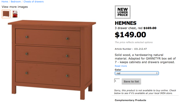
It got me thinking about bold pieces of furniture. When you’re on a budget, investing in furniture that is reasonably priced with a classic or neutral feel can seem like the smartest choice to make because it’s something that is guaranteed to stay with you for a long time. Even though this dresser is now only $149 CAD, and would not completely break the bank if I wanted to re-invest in another one in the future, it still felt like agony to choose between the neutral finishes IKEA offers. So I decided to make a bold move and enter into the new world of brightly-colored furniture.

I have to say folks: it’s a whole lotta fun.

I don’t advocate going crazy and immediately re-furnishing your apartment in the wackiest, craziest colors you can find. But everything that we were buying for our apartment at the time was feeling really neutral and boring and I was sick of trying to figure out “accents” in the form of pillows and paintings.

Choosing one or two items for your apartment or house (unless you’re feeling really adventurous) in a bold hue or in a fun pattern can be a great way to add visual interest to a room and give it a nice, layered look as opposed to something that’s stiff and formal. And if you move in the future or decide to re-decorate, it can be a fun little challenge to see how you can incorporate that funky chair or wild dresser into your new color scheme.

I did a little searching around to some of my favorite stores and came up with some other bold examples that may find their way into someone’s awesome new room. You really don’t have to limit yourself with one color scheme.

Urban Outfitters Sofa

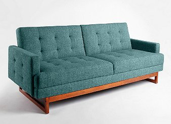
I’m in love with this little loveseat from Urban Outfitters. It’s got this 70s feel, but with an edge, and the teal color is to die for! I’m in love with airy blue rooms at the moment and this would fit right, giving everything a mermaid-ish feel. Or if you wanted to kick it up a notch, I’d throw in some punchy coral and navy blue to give it more of a Mediterranean vibe. For those who just want to dip their toes into the world of colorful furnishings, I’d put this sofa in a smoky gray room with some charcoal accents. Maybe even a little lilac even if you’re daring. Oooh la la.

IKEA Chair
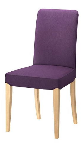
Speaking of lilac, how about this little lady from IKEA? This chair has nice, clean and classic lines but when paired with purple upholstery it would pack a punch in a dining room. Can you picture a row of these lined up at a chunky black-brown dining table with soft lilac walls and silver accents? For a look that’s a little less muted, you could substitute accent pieces in fun colors like chartreuse or raspberry.

Coffee Table

Why, hello hello yellow coffee table. This vision in citrus is from cb2 and would look dynamite in an ultra-modern room filled with neutrals and whites, and maybe a crazy rug in a zebra print style. Add a vase of hot-pink roses and you’d have a living that screams, “Come back to life Domino magazine and photograph me!” Or sneak a pop of color in a room filled with cream, beige and bone color and layer in pieces of rust and burnt orange for an updated sixties feel.

As for what I’m going to do with my cheery red dresser, you’ll have to wait and see but after my little virtual shopping spree I think I’ve definitely caught the colorful furniture bug. You’ll have to stay tuned to see what my next purchase will be.

I want to see pictures of your latest bold purchase. Email them to me at thetwentiesproject@gmail.com or post the piece you’re coveting to Pinterest so we can share it on one of our boards.

when holiday decorations go wrong

photo credit to livingsocial.com

Remember that awesome holiday party you attended last week? Come on, you totes remember the punch and the homemade shortbread, with those sprinkles, you were scarfing down. Then, when no one was looking, you puked in the potted plant next to the bathroom door – do you remember how it looked? All wet, gross and riddled with the red and green sprinkles, okay – do you have that visual in your mind – that is NOT what your apartment door, front lawn or roof resemble come Christmas.

I love the holidays and relish in the many ways people choose to decorate their homes; I even make special trips down to Holt Renfrew, every year, during the holiday shopping season, just to stand across the street and marvel at the window displays. There has always been something uniquely beautiful about the holiday season – the silver and gold, if you will – am I pretty much over the ugly Christmas decorations people insist on displaying all. over. their. properties … for all to see.

There are far too many homeowners living in my neighbourhood with horrendously ugly christmas decorations, which they have literally littered their properties with. I will not discuss the inflatable snowmen lining some of the narrow streets, the mismatched christmas lights swirled awkwardly into sparse evergreens, the inappropriately high wreaths nailed to front doors, nor will I attempt to touch the sad affinity, some have, for constructing their own versions of the nativity scene, on their front lawns. I have never been very religious but I honestly do not remember, during the handful of church sermons I was forced to endure in my childhood, Elvis being one of the three wise men.

What we will discuss are the armies of four-foot plastic Frostys, Santa Clauses and Rudolphs arranged, in a row, on several roofs.

Why?

Because they are disgusting and need to be destroyed, discontinued and the remaining models incinerated. You would think, in a neighbourhood, where most residents spend upwards to two hundred dollars on a garbage can, which houses nothing more then their household waste, in between garbage days, would show similar need to flaunt their wealth during the holidays.

My parents have always believed christmas decorations are an investment, a mindset adopted from their parents. A lot of the decorations and ornaments we have hung on the christmas tree, wrapped around the banisters and strung outside were passed down throughout the years – and, believe me, there is NOT one cheap plastic piece in the mix.

We can all protect ourselves from passersby crying out in horror when they walk by, or dry-heaving into your bushes; so, here we go.

1. Take a walk and know your competition. There is nothing worse than being the only house in the neighbourhood which does not fit, so choose the colours accordingly. For example, if your neighbours have hung white and silver lights then you should have white lights in your design plan … throw in a colour; try white lights with every other colour being red or green.

The effect will be similar to a wrapped, luminescent, candy-cane you created as the foundation to your overall design. As an added bonus, not only will you fit in with the rest, but it will still draw peoples eye to your home, in a good way.

2. Know your limits and keep within them. There are always those people, maybe you are one of them, who just cannot see when enough is enough – the entire property does NOT need to be touched by decorations. Less is more, please believe me when I say that.

Choose one large decoration, and pair it with a few smaller decorations. Something which always looks classically beautiful is white lights wrapped into artificial garland hung on the posts on our porch – my mother matches the garland to the wreath she hangs on the door.

3. Say no to plastic and always remember that. Those christmas decorations you see in Canadian Tire, Zellers or Walmart during the holidays, you need to step away from the aisle … in fact, I need you to pretend it does not exist. I know they are cute and they draw you in with their cute little smiles and charming airbrushed little faces but they will only drag you down.

Way down, like into the trench terrible. And when it happens to rain or the snow melts, then those plastic decorations look absolutely horrendous … the paint chips, the plastic cracks and they are targets for drunken teenagers to take their frustrations out on.

Do you want to clean-up broken plastic? The answer is no, when will you all learn, the answer is always no!

4. Wreaths should be hung at eye-level, ’nuff said.

5. On the subject of nativity scenes … please, leave them to the religious institutions. You are not Pastor Bob or the Bishops Wife and you do not need to build a four foot manger that houses real hay and those plastic characters.

So, there we go.

Please follow these easy tips and we can all be friends this holiday, stray away from them and I will hurl coal at your plastic reindeer.

Do you have photos of some horrendous decorations you need to show someone? Send them and whatever tips you want to thetwentiesproject@gmail.com